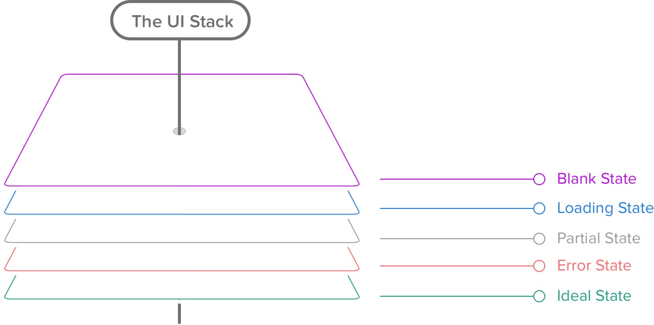
The five UI states
Nov 27, 2015
Just found a great article about the 5 states every UI has to implement:

Ideal State
This is the first state I create, since it’s what you want people to see most often. Aptly named, it embodies the zenith of your product’s potential — when your product is providing maximum value and is full of useful, actionable content. It’ll serve as the foundation for every other state you’ll create for this screen. Think of this as the quintessential marketing page or mobile app store screenshot.
Empty State
An empty state really is bigger than just one screen. It’s about providing your customer an incredible first impression as you introduce them to your product — to spur them to action, keep them interested, and remind them of the value your product’s going to provide.
Three versions:
- What’s seen by your customer the first time they use your product.
- What’s seen when your customer voluntarily clears existing data from the screen, like when you attain “Inbox Zero”.
- What happens when there isn’t anything to show, say, for a search result.
Error State
The screen when things go wrong. Typically, this is more complex than just one screen, since errors can occur in surprising combinations. Error states can include anything from form data that’s missing or invalid; an inability for your app to connect to the server; trying to move forward to the next step without finishing an upload, leaving a page without text submitted, and more.
Partial State
The difference between an error state and an ideal state is like night and day. But how does the screen look when there’s only one row of data? A few photos? A half-completed profile? The partial state is the screen someone will see when the page is no longer empty and sparsely populated. Your job here is to prevent people from getting discouraged and giving up on your product.
Loading State
It’s easy to overlook this state, and many product designers insert it as an afterthought. But there’s a very real burden that comes with setting expectations. When your app is loading data, waiting for an Internet connection, or transitioning to another screen, you must take great care to be mindful of how you represent situations where you’re fetching data. This can consist of an entire page takeover, lazy loading of content panes, or inline loading, potentially used when one might look up username availability from a form field.
